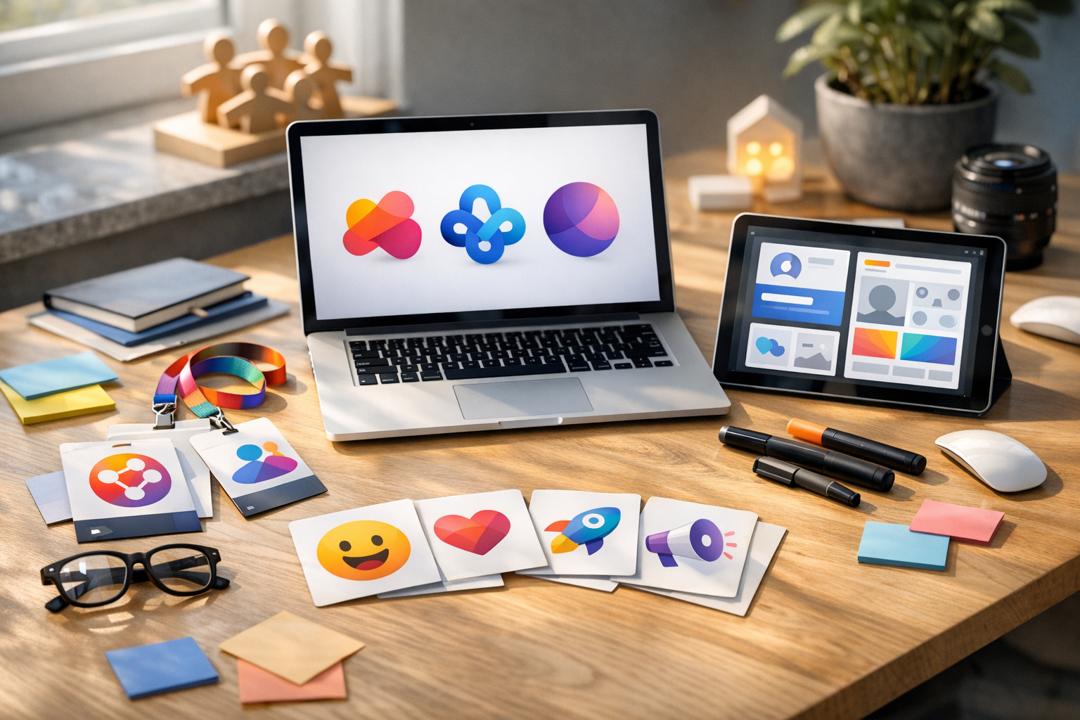
A platform-agnostic, evergreen guide to designing and governing a cohesive visual system that strengthens recognition, trust, and engagement globally.
You should recognize your community in one glance. A visual identity—logos, badges, emoji, and templates—builds trust, speeds onboarding, and unifies Discord, Slack, Circle, or forums into a single coherent experience. Here’s a platform-agnostic toolkit to make your online community instantly recognizable, whether you’re launching fresh or evolving something established.
Most community builders treat branding as an afterthought—a logo slapped together at launch and never revisited. The result? A fragmented visual experience that erodes trust signals, confuses new members during onboarding, and makes your community indistinguishable from thousands of others.
Here’s how to build a community visual identity toolkit that works across platforms, scales with your growth, and turns casual participants into proud ambassadors.
Why Visual Identity Matters for Online Communities (Trust, Onboarding, Growth)
Brand recognition isn’t just for corporations. Research consistently shows that consistent visual presentation increases trust and perceived professionalism. For online communities, community brand guidelines translate directly into:
- Faster member onboarding — New members immediately understand where they are and what the space represents. Clear brand assets eliminate confusion from the first interaction.
- Stronger belonging — Shared visual symbols create in-group identity. Badges, emoji, and templates become culture markers.
- Cross-platform consistency — Whether your community spans Slack, Discord, Circle, or Discourse, consistent visuals unify the experience across every touchpoint.
- Organic growth — Branded templates for social sharing turn every member post into a recognition moment that attracts new participants.
For a step-by-step launch plan that includes visual identity as a foundational element, see Community Launcher’s community strategy frameworks.
The Four Pillars of a Community Visual Identity Toolkit
Logo and Avatar System: Cross-Platform Community Branding
Your logo needs to work at every size—from a 16px favicon to a full-width banner. Design a primary logo, then create adaptive versions that maintain cross-platform consistency:
- Full logo lockup for websites, welcome screens, and printed materials.
- Compact mark (icon or monogram) for avatars, app icons, and small-space placements. Test at 16–32px to ensure legibility.
- Light and dark mode variants because your members browse at midnight and platforms render backgrounds differently.
Provide brand assets in SVG and PNG formats so moderator tools and member resources work seamlessly across devices.
Pro tip: Create a dedicated “community avatar” that’s distinct from your company logo. This subtle separation signals that the community belongs to its members, not just the brand. It’s a powerful trust signal that encourages ownership and participation.
Badge and Role Icons: Recognition and Reputation Design
Badges are powerful behavioural motivators and essential moderator tools. They reward contribution, signal expertise, and create aspiration. Design a badge system that includes:
- Role badges (Admin, Moderator, Mentor, New Member) — these serve as instant trust signals within discussions.
- Achievement badges (First Post, 100 Contributions, Event Attendee) — these gamify participation and create visible reputation.
- Seasonal or limited-edition badges to create urgency and delight, rewarding community milestones and special events.
Keep badges within a unified design framework—consistent shape, stroke weight, and colour palette—so they feel like a collection rather than random clip art. Launch with 6–8 role badges and expand quarterly based on member behaviour and community goals.
Custom Emoji Packs: Culture Signals for Discord, Slack, and Forums
Custom emoji are the micro-interactions that define community culture. They carry inside jokes, reinforce values, and make communication more expressive than standard reactions allow. When designing a custom emoji pack:
- Start with 10–15 essential reactions that reflect your community’s tone (celebration, agreement, humour, support, gratitude).
- Use a consistent art style—flat illustration, pixel art, or hand-drawn—that aligns with your broader community visual identity.
- Involve members in the creation process. Polls, design contests, and suggestion threads build investment and surface authentic culture.
- Refresh seasonally to keep the experience dynamic and give long-term members something new to discover.
Provide emoji at 128–256px PNG with 1x/2x versions for both dark and light modes to ensure crisp rendering across Discord, Slack, and forum platforms.
Cover Images and Post Templates: Shareable Brand Assets for Members
Give members branded tools they’ll actually use. Shareable templates—for introductions, event announcements, discussion prompts, and social sharing—accomplish two things: they reduce friction for contributors and they spread your community visual identity organically across platforms.
Provide templates in accessible formats (Canva links, Figma files, or simple PNG frames) so members of all skill levels can participate. Every template should carry your colour palette, typography, and logo mark consistently.
Get sample brand assets and governance checklists from Community Launcher to accelerate this process.
Brand Governance: Lightweight Community Style Guide
A toolkit without governance becomes chaos within months. Establish simple community brand guidelines that anyone can follow:
- Document everything in a lightweight brand guide—colours (with hex codes), fonts, spacing rules, logo clear space, and usage dos and don’ts.
- Centralise brand assets in a shared, version-controlled library that moderators and members can access anytime.
- Assign ownership — designate a community member or small team responsible for visual consistency. This becomes an important moderator tool for maintaining quality.
- Audit quarterly — review how assets are being used, retire what’s outdated, and refresh what’s stale. Track which badges and emoji see actual engagement.
Start Before You Think You’re Ready
You don’t need a design agency or a massive budget. You need intentionality. A cohesive community visual identity built with free tools and clear principles will always outperform expensive but inconsistent design work.
Begin with your logo system and a handful of role badges. Add emoji as your culture crystallizes. Introduce templates once you understand what members share most. Layer governance as complexity grows.
Your community’s visual identity isn’t decoration. It’s infrastructure. Build it deliberately, govern it lightly, and watch recognition compound into trust.
Ready to unify your community’s visuals? Explore Community Launcher for frameworks, templates, and rollout guidance that align your brand strategy from the ground up.
Frequently Asked Questions
What is a community visual identity?
A consistent set of logos, colours, typography, badges, and emoji that makes your online community instantly recognizable across platforms. It functions as your community’s silent ambassador—building trust before a single word is read.
How do I design a logo that works everywhere?
Create a primary lockup, a compact mark for avatars, and light/dark variants. Test at 16–32px for small placements and at banner size for headers. Provide files in SVG for scalability and PNG for quick use.
How many badges and emoji should I start with?
Launch with 6–8 role badges and 10–15 essential emoji reactions. Expand quarterly based on member behaviour, community milestones, and feedback. Starting small keeps quality high and gives you room to reward growth.
Which file formats and sizes should I provide?
SVG and PNG for logos and badges. 128–256px PNG for emoji. Include 1x and 2x versions for both dark and light modes. Provide Canva or Figma links for editable templates so members of all skill levels can use them.
How do I roll out a visual refresh without confusion?
Announce the reasoning behind the change, share a one-page style guide, offer updated templates, and phase changes over 2–4 weeks. Give members time to adopt new assets gradually. For rollout playbooks and transition frameworks, see Community Launcher.
Invest in your visual toolkit today, and every interaction becomes a branding moment tomorrow.








Leave a Reply